Images are shown at 1/3 size below. Use browser “save link as”
to get PNG files of images 1200px wide with transparent background.
It would be fairly easy to adjust colors, text labels, etc. if you like.
Elaine C. Meng / meng@cgl.ucsf.edu /
home page
#15
- If you like ViewDock (as in the
Screening Docked Molecules Image Gallery entry),
here is a version to be placed over a white- or light-colored page:
Besides the Image Gallery entry, there is also a
feature highlight.
The dialog image is not 1200px wide, it is the actual size of the dialog.
Can use HTML to put a border (outline) around it, as is done here.
- Another nice possibility is a transparent-background version of the
p53 Cancer Mutations Image Gallery entry:
Two images, the same except for lighting style.
See the Image Gallery entry for caption information.
#16
Many possibilities...
- Here's a large transparent-background version of the image from the
Coloring by Conservation feature highlight:
See the feature highlight for caption information. The corresponding
sequence alignment is shown in the
Multalign Viewer dialog image (not 1200px wide but the
actual size of the dialog; as you can see by the horizontal scroll bar,
only part of the alignment is visible).
As above, HTML was used to put a border (outline) around it. You may not
want the dialog image, I just included it for completeness and it shows
some other neat features like the tree relationship of the sequences,
obtained along with the (seed) sequence alignment from the
PFAM database.
- I don't remember how I made the
morphing feature highlight
animated GIF (Chimera doesn't write that format), but you could use
it “as is” if that would suffice. However, the
Ball-and-socket motion movie in the Animation Gallery
may be a nicer example of morphing anyway.
(H.264 format is what we uploaded to YouTube)
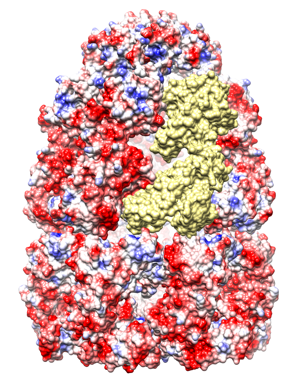
- There are many possibilities if you want to show a surface colored
by electrostatic potential (ESP). One thing to consider is that you will
already be showing surfaces colored by ESP in illustration #25.
Putting that aside, however, in my opinion, the chaperonin image
is “meh” with clear background because in the original
Image Gallery entry,
the back half recedes into darkness and then is cut off (but see it
here if you want).
Here are some alternatives:
 |
 |
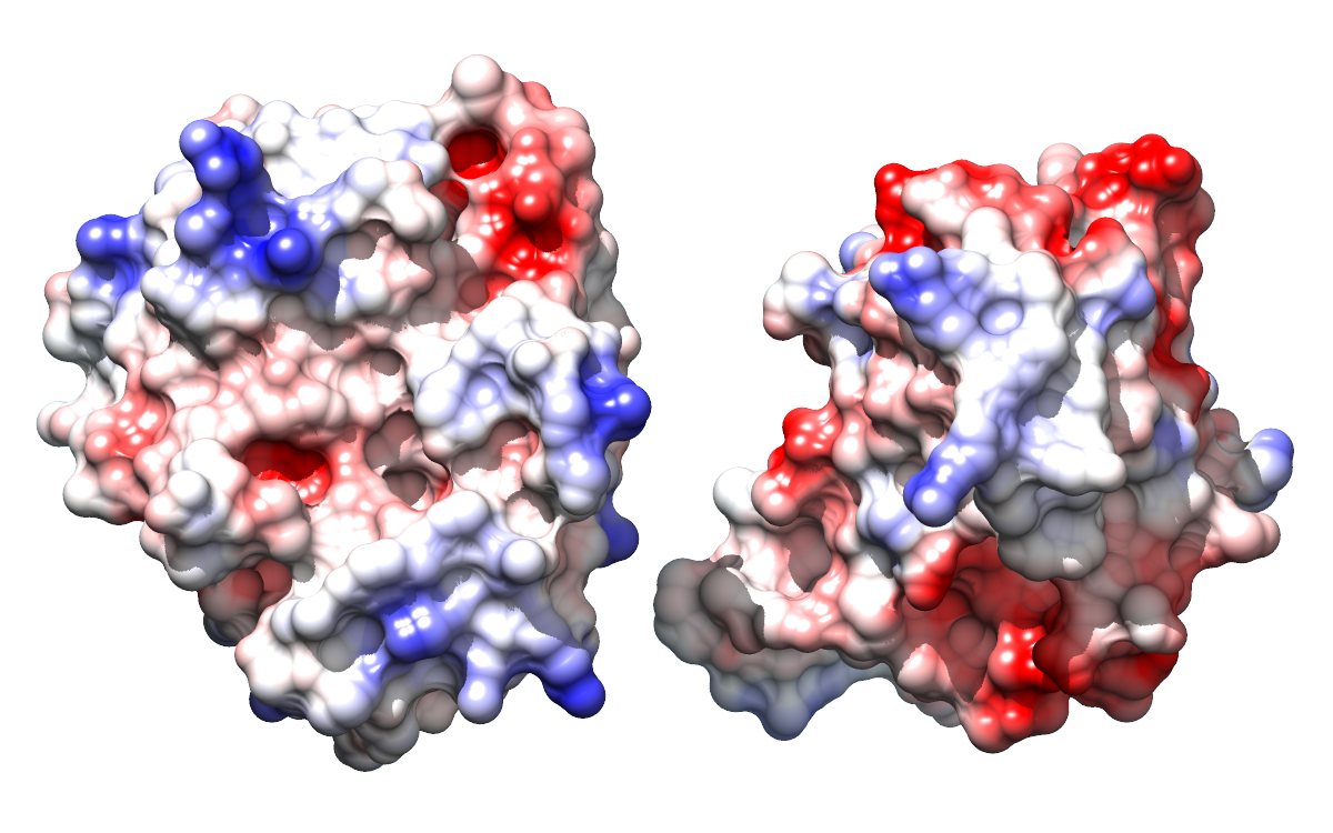
Two images in different styles of a protease domain (from PDB entry
3eeb)
bound to a highly negatively charged small molecule,
inositol hexakisphosphate (sticks).
The molecular surface is colored red (negative) → white (neutral) →
blue (positive) by Coulombic ESP, as in the
Surface Properties image tutorial.
You can see the markedly positive ESP in the binding pocket.
|
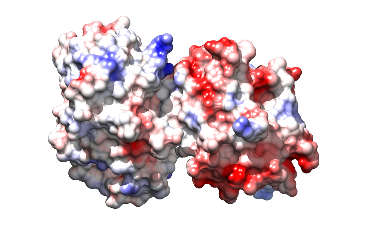
- The above shows electrostatic complementarity between a protein and a
small molecule. The following shows it between two proteins:
 |
This shows the binding interface between
porcine pancreatic trypsin (left) and a trypsin inhibitor from soybean (right).
In the open position, each protein is rotated 90 degrees outward from the
closed (bound) position shown on mouseover.
Adapted from the
Opened Interface image tutorial.
Get full-sized (1200px wide) images from these links:
[open]
[closed]
Animation open → closed → open:
The motion in the animation is simply illustrative
and not meant to be physically reasonable.
The open position has the proteins slightly farther apart than in the
image at left, to decrease their apparent intersection upon rotation
to the closed position.
|
#17
- Again many possibilities, but how about a viral capsid?
Here are two images of the hepatitis B viral capsid (made from PDB entry
2g33 using the Chimera
Multiscale Models tool):
 |
|
 |
Hepatitis B virus, capsid diameter approximately 420 Å.
Each “blob” is a separate protein chain, with multiple copies
of the same chain shown in the same color. In the righthand image, one
copy of each protein is shown as ribbons instead of as a blob.
|
#18
Of the two possibilities you mentioned,
I think you should go with the “Electron tomography of human immune
T-cell” image in Tom Goddard's
Nov
2012 presentation.
There is already plenty of fitting in your suggestions for illustration #19.
If you need more caption information or a larger or otherwise revised image,
we will need to ask Tom G.
#19
Of the two possibilities you mentioned, the
myosin analysis movie in the Animation Gallery (if feasible)
seems nicer, and wouldn't there be copyright issues with images from the
JSB paper?
We didn't have everything needed to reproduce exactly that movie,
but we remade a very similar one:
(H.264 format is what we uploaded to YouTube)
#20
(screenshot from structureViz page)
If you need something custom, we would need to ask Scooter Morris.
#21
(fig 5
from MCP paper)
Note: as per
journal instructions, should be accompanied by citation:
This research was originally published in Molecular & Cellular Proteomics.
JH Morris, EC Meng, TE Ferrin. Computational Tools for the
Interactive Exploration of Proteomic and Structural Data.
Molecular & Cellular Proteomics. 2010; 9:1703-1715.
© the American Society for Biochemistry and Molecular Biology.
#22
It's just a screenshot of a web page, you can have at it here
(your guys can probably get the image you want, or you can try
explaining to me exactly what you had in mind):
http://sfld.rbvi.ucsf.edu/django/family/10/
#23
Some of the original Cytoscape network analysis for the
“unknown” featured in the
functional annotation scenario is shown in Fig. 1
of the Lukk et al. paper:
http://www.pnas.org/content/109/11/4122/F1.expansion.html.
You could try to get permission to reuse that figure (it wasn't made by
our group), but as an alternative, below is a network image from Scooter.
(Sorry, not transparent background; I tried in Photoshop but couldn't do it
without also obliterating some of the edges.)
You can see that the unknown (yellow) clusters more with the dipeptide
epimerases (light green) than with the chloromuconate cycloisomerases
(light red; this was the function suggested by the incorrect annotation of
the unknown) or other families in the enolase superfamily.
I thought the color key image from Cytoscape was annoying in terms of
font, spacing, and ordering, so I reimplemented it in HTML (easier for
your guys to use/modify if they want).
 |
color key image from Cytoscape:
 |
color key done in HTML:
| |
unknown |
| |
dipeptide epimerase |
| |
chloromuconate cycloisomerase |
| |
muconate cycloisomerase (syn) |
| |
muconate cycloisomerase (anti) |
| |
N-succinylamino acid racemase 2 |
| |
o-succinylbenzoate synthase |
| |
unclassified |
|
#24
The screenshots in
http://www.rbvi.ucsf.edu/chimera/data/sfld2014/sfld2014.html
are not amenable to much revision.
However, I made another version of the screenshot in which the five
comparative models are recolored to be more distinguishable from one another
and to make the magenta model correspond to that in illustration #25:
A black border was added using HTML. Hmm, this looks so much better,
I think I'll replace my figure in that other page!
#25
Higher-resolution, transparent-background versions of the last figures in
http://www.rbvi.ucsf.edu/chimera/data/sfld2014/sfld2014.html:
 |
 |
Pocket surfaces colored by Coulombic ESP for the template structure 1tkkA
(left) and a comparative model of MCA 1834 (right).
The righthand surface looks a little blocky, but there were technical problems
with making it smoother.
|


